OEE analytics for operations: analyse, prioritise, act
- 1 day ago
- 13 min read

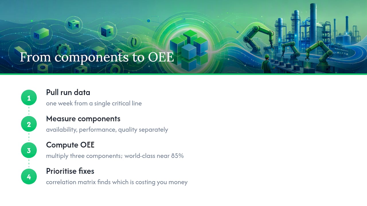
OEE analytics measures how effectively equipment converts planned production time into good parts, and turns that number into a decision instead of a report. The first move if you have none of this today: pull one week of run data from a single critical line, availability, performance, and quality separately, before touching anything else. The three components multiply into a single score, world-class plants hold that figure near 85%, and a correlation matrix is the fastest way to work out which of the three is actually costing you money.
Key Takeaways
Point | Details |
Start with one line | Pull a week of Availability, Performance, and Quality data separately before building anything else. |
Use the formula correctly | OEE = Availability × Performance × Quality, validated in Excel against a manual logbook check. |
Benchmark realistically | World-class OEE sits near 85%, but most plants run at 40 to 60%, and that gap is the improvement budget. |
Prioritise with correlation, not guesswork | Run a correlation matrix in a tool like Minitab to find which component actually drives OEE variation. |
Get engineering support for the pipeline | Sentient Concepts builds the data platform and manages ongoing operations behind sustained OEE analytics. |
Table of Contents
What Does OEE Analytics Actually Mean?
Overall Equipment Effectiveness measures three things separately, then multiplies them together. Availability is the share of scheduled time the machine actually ran. Performance compares actual output speed against the ideal cycle time. Quality is the percentage of parts that pass first time, with no rework.
The formula is straightforward:
OEE = Availability × Performance × Quality
Plain OEE reporting stops at that single number, usually calculated once a shift and typed into a spreadsheet. OEE analytics changes what happens next: sensors and PLCs push run states and cycle events into a time-series database, the composite score gets calculated automatically, and any manager can drill from the headline figure down into a single fault code on a single machine, at any hour of the day. That drill-down is the entire point. A number on its own tells you nothing; a number you can interrogate tells you where to send a technician.
How Do You Calculate OEE With a Real Example?
Take a single 8-hour shift, 480 minutes of scheduled time.
Planned production time: 480 minutes, minus 30 minutes of scheduled breaks, leaves 450 minutes.
Downtime: 45 minutes of unplanned stops. Run time = 405 minutes. Availability = 405 / 450 = 90%.
Performance: ideal cycle time is 1 part per minute; the line actually produced 350 parts in 405 minutes of run time. Performance = 350 / 405 = 86.4%.
Quality: of those 350 parts, 15 were scrapped or reworked. Quality = 335 / 350 = 95.7%.
OEE = 90% × 86.4% × 95.7% = 74.4%.
In Excel, put planned time in A1, downtime in A2, produced parts in A3, good parts in A4, and ideal cycle time in A5. Availability is =(A1-A2)/A1, Performance is =(A3*A5)/(A1-A2), Quality is =A4/A3, and OEE is =B1*B2*B3, formatted as a percentage. Add a sanity-check cell comparing your computed run time against total shift minutes minus logged stops; if they do not reconcile, someone missed a downtime entry.
Sensor-derived OEE and manual logbook OEE rarely match, often by 10 to 20 points, because operators round short stoppages up or simply forget them under five minutes.
Pro Tip: Calculate OEE at shift level first, then daily. Hourly averages smooth over the exact micro-stoppages you are trying to find, and daily averages can hide a bad shift entirely.
What Are the Real Benefits of Tracking OEE Analytics?
The business case is not abstract. Once you can see availability, performance, and quality separately, in near real time, the decisions change shape.
Higher throughput without buying new equipment, because you stop losing capacity to unrecorded micro-stops.
Less unplanned downtime, since fault patterns show up in the data weeks before a technician would spot them on the floor.
Clearer root-cause priority, because you can rank losses by minutes lost rather than by whoever complained loudest.
Shift-to-shift transparency, removing the argument about whose numbers are “real”.
Evidence-based capital decisions, since you can point to a specific bottleneck machine rather than guessing which line needs investment.
Practical use cases follow directly: live shift-visibility dashboards on the plant floor, automated bottleneck flags when a line’s performance component drops below a threshold, predictive maintenance triggers fed by downtime pattern classification, and multi-site benchmarking once every plant reports the same way.
On benchmarks: a world-class OEE target sits around 85%, typically built from roughly 90% availability, 95% performance, and 99.9% quality. Most plants actually operate in a moderate to lower range, and that gap is not a failure, it is where the improvement budget should go.
What Capabilities Should an OEE Analytics Platform Have?
Not every tool needs every feature, but a few capabilities separate a genuinely useful system from a dashboard that gets ignored after a month.
Automated machine connectivity through open protocols like OPC UA or MQTT, so you are not manually keying stop reasons.
Time-series storage built for high-frequency event data, not a relational database bolted on after the fact.
Real-time computation, ideally through streaming queries and materialised views that recalculate Availability, Performance, and Quality continuously rather than in nightly batches.
Dashboards with drill-down to the Six Big Losses (breakdowns, setup and adjustment, minor stops, reduced speed, startup rejects, production rejects).
Downtime classification that is consistent across shifts and sites, not free-text.
On deployment, edge processing keeps latency low and data on-site, useful in security-sensitive or bandwidth-constrained plants; cloud gives you multi-site aggregation and easier scaling; most serious rollouts end up hybrid. Integration with MES and ERP matters more than people expect, because order context and part type turn a raw OEE number into a comparable one across products and shifts.
How Do You Roll Out OEE Analytics Without Disrupting Production?
Start small, prove the number, then scale the architecture rather than the chaos.
Scope and audit: list every machine on the target line, its existing sensors or PLC outputs, and any gaps that need retrofitting.
Pick one pilot line: choose a genuine bottleneck, not the easiest machine to wire up. A pilot on a line nobody cares about proves nothing.
Define sample frequency: capture machine state changes as events, not periodic polls, so short stops do not disappear into an average.
Set success metrics before you start: a specific OEE uplift (say, 5 to 8 percentage points) or a downtime reduction target, agreed with the plant manager up front.
Validate against manual logs for two to four weeks before trusting the automated feed exclusively.
Assign owners: an operations owner accountable for the number, a data engineer maintaining the pipeline, a quality lead validating scrap data, and a continuous improvement sponsor who actually acts on findings.
Scale the architecture, not the guesswork: reuse the same connectivity pattern, standardise downtime codes plant-wide before adding a second line, and train operators on why the data matters, not just how to log a stop.
A realistic pilot on one line, from wiring to a validated dashboard, commonly takes 6 to 10 weeks. That includes the awkward stretch where automated and manual numbers disagree and someone has to work out why.
Pro Tip: Get the continuous improvement sponsor to commit, in writing, to acting on the first three findings the pilot produces. A pilot that generates insight nobody acts on kills momentum for the plant-wide rollout faster than any technical failure.
Which OEE Component Should You Fix First?
Composite OEE tells you the size of the problem, not its cause. That is where correlation analysis earns its place: correlate the overall OEE score against each of Availability, Performance, and Quality across your production history, and look at which coefficient is closest to 1.
In one worked example using Minitab to analyse a plant’s OEE dataset, availability correlated more strongly with OEE than performance or quality in a documented example. That plant had been investing heavily in quality inspection stations. The correlation matrix said the money should have gone into fixing unplanned stoppages instead.
To run this yourself:
Pull at least 30 to 60 shifts of paired data (OEE and its three components) into Minitab or a similar statistics package.
Generate a correlation matrix across all four variables.
Rank the components by coefficient strength, not by which one looks worst on the surface dashboard.
Validate with a control chart before and after the fix, and a simple before/after t-test to confirm the improvement is real, not noise.
Pro Tip: Align timestamps across all three components to the same production event, not the same clock hour. A five-minute misalignment between your downtime log and your quality log will quietly wreck the correlation.
Which Type of OEE Tool Fits Your Plant?
Vendors broadly fall into four categories, and the right one depends on your plant’s age and ambitions more than on brand reputation.
Lightweight edge OEE agents suit legacy PLC-heavy plants where a full platform migration is not realistic; they read existing signals and compute OEE locally with minimal wiring.
Cloud-native OEE platforms suit multi-site operators who need centralised benchmarking and are comfortable with data leaving the site.
MES modules with built-in OEE suit plants that already run a manufacturing execution system and want OEE as one more view inside it, with order context already available.
Bespoke analytics builds suit plants with unusual processes or a need for predictive maintenance and machine learning layered on top of the raw OEE feed, where off-the-shelf dashboards fall short.
For a quick pilot on one line, the lightweight edge route wins on speed. For a genuine multi-site rollout, cloud-native or MES-embedded options handle the aggregation better. Whichever category you land in, bring statistical rigour to the analysis stage using a tool like Minitab, and treat enterprise IIoT guidance (IBM’s perspective on OEE integration is a reasonable starting point) as context, not gospel, for your specific plant.
Why Chasing the Composite Score Alone Is a Mistake
The most common failure in OEE programmes is treating the single percentage as the whole story. Six months later, OEE has moved two points and nobody can say which spend caused it.
Correlation analysis exists precisely to stop this. Before allocating budget, run the correlation matrix described earlier and let the coefficients rank your priorities. If availability dominates, stop funding quality inspection upgrades and go after changeover time and unplanned stops instead.
A second common mistake is inconsistent downtime coding. If one shift logs a stoppage as “material shortage” and another logs the identical event as “operator break”, your root-cause data is worthless no matter how good the dashboard looks. Standardise downtime codes before you standardise anything else.
A third mistake is comparing OEE across dissimilar products or shifts without context. A line running a complex, low-volume part will show lower performance than the same line running a simple, high-volume part, and that is not a performance problem, it is a product mix problem. Pull order and part-type data from MES or ERP before drawing conclusions from a raw comparison.
Finally, plants often chase 85% as a universal pass mark. It is a useful reference point, not a target that fits every process; a complex, low-volume operation may never reach it and should not be judged against a benchmark built for high-volume, repetitive manufacturing.
How Should You Read OEE Analytics to Make Decisions?
A dashboard full of numbers is not the same as a decision. Reading OEE analytics well means asking three questions in order, every time a number moves.
First: which component moved? If availability dropped, look at the downtime log for that window, not the whole shift. If performance dropped, check whether cycle times drifted or whether a slower operator was on shift. If quality dropped, check for a material batch change before blaming the machine.
Second: is the move real or noise? A single bad shift is not a trend. Compare against a control chart of recent history before reacting; a one-off dip inside normal variation does not need a corrective action, and treating it as one wastes engineering time.
Third: what is the smallest intervention that addresses the actual driver? If a correlation matrix already told you availability is the dominant lever, and a specific fault code is recurring, the decision is usually narrow: fix that fault, retrain on that changeover step, or replace that specific part. Resist the urge to launch a broad initiative when the data points at one machine.
The output of good OEE analytics is never “OEE is 62%, we need to do better.” It is “availability on Line 3 dropped 6 points this week, driven by a recurring conveyor jam logged nine times, fix the conveyor guide by Friday.” Specific, dated, attributable. If your dashboard cannot produce a sentence that concrete, the analytics layer needs more drill-down, not more charts.
What Do Real OEE Analytics Rollouts Actually Look Like?
The pattern that shows up repeatedly across plants that get this right starts small and stays disciplined about validation.
A common sequence: a plant picks its worst-performing line, wires it with basic PLC connectivity, and runs manual and automated logging in parallel for a few weeks. The automated feed almost always shows lower availability than the paper log, because operators under-report stoppages under five minutes. Once that gap is accepted as real, not disputed, the plant has its actual baseline for the first time.
From there, the correlation step usually reshapes the improvement plan. A plant expecting to need new machinery often finds, once availability, performance and quality are separated and correlated, that changeover time between product runs is the dominant loss, not machine age. That is a training and procedure fix, not a capital expenditure, and it is far cheaper.
Multi-site operators layer a second stage on top: once every plant reports OEE the same way, with the same downtime codes and the same time-series structure, the head office can genuinely compare Plant A against Plant B for the first time. That comparison routinely surfaces one site quietly outperforming the rest through a simple procedural difference nobody had documented, a faster changeover sequence, a different shift handover routine, that then gets rolled out everywhere else.
The through-line in every version of this story is the same: the value did not come from installing sensors. It came from validating the data against reality, then using statistics rather than intuition to decide what to fix first.
What Analysis Techniques Go Beyond Basic OEE?
Basic OEE tells you the score. A handful of techniques, layered on top, tell you why and what happens next.
Root cause analysis takes a recurring downtime code and works backward through the Six Big Losses framework to a specific mechanical or procedural cause, rather than stopping at a generic label like “breakdown”. Pairing this with automated, timestamped downtime capture makes the pattern-finding far faster than reviewing paper logs.

Trend analysis looks at OEE and its components over weeks and months rather than shifts, catching slow degradation, a bearing wearing out, a tooling issue worsening gradually, that a single shift’s number would never reveal. Control charts are the standard tool here: they flag when a metric moves outside expected variation, separating a genuine problem from normal shift-to-shift noise.
Machine learning sits on top of both once you have enough validated historical data. Anomaly detection models can flag an unusual vibration or cycle-time pattern before it becomes a stoppage, effectively turning reactive maintenance into predictive maintenance. This only works, though, once the underlying OEE data is clean and consistently coded; feeding noisy, inconsistently logged downtime data into a predictive model just produces confident, wrong predictions.
The sensible order is root cause analysis first, because it is cheap and clarifies what “good” data even looks like, trend analysis once you have a few months of clean history, and machine learning only once both of those are solid. Skipping straight to predictive maintenance on unvalidated data is a common and expensive shortcut.
How Do You Keep OEE Analytics From Fading Out After Six Months?
Most OEE programmes do not fail at launch. They fail at month seven, when the dashboard is still running but nobody is acting on it anymore.
Sustaining the programme is mostly a change management problem, not a technical one. Operators who see the data used against them, to justify blame rather than fix problems, stop engaging with it honestly within weeks; stoppage codes get logged vaguely or not at all. The fix is cultural: review OEE data in shift meetings as a shared problem to solve, not a scorecard, and make sure the first few findings from any new dashboard lead to a visible fix, not just a conversation.
Governance needs a permanent home, not a project team that disbands after the pilot. Someone has to own downtime code standards as new equipment gets added, someone has to review whether the correlation priorities have shifted as the plant’s problems change, and someone has to keep MES and ERP integration current as product lines evolve. Without a named owner, these all quietly rot within a year.
Retraining matters more than most rollouts budget for. New operators need to understand why a stoppage code matters, not just which button logs it, and refresher sessions after any dashboard change prevent the slow drift back to inconsistent logging.
Finally, revisit the correlation analysis periodically rather than treating the first result as permanent. Fix the dominant availability driver and performance may become the new bottleneck; the priority ranking changes as the plant improves, and a programme that keeps re-running the analysis stays useful for years instead of six months.
A Practical Note on What Actually Makes This Work
The pattern worth flagging is how often plants over-invest in dashboards and under-invest in data validation. A beautiful real-time dashboard fed by inconsistent downtime codes is worse than no dashboard at all, because it looks authoritative while being wrong. What consistently separates the rollouts that stick from the ones that quietly die is operator buy-in early and a genuine correlation exercise before spending on fixes, not after. Getting the data pipeline, the governance, and the statistical prioritisation right the first time tends to matter more than which platform sits on top of it.
How Sentient Concepts Supports OEE Analytics Rollouts
Building this properly, wiring machine connectivity, standing up a time-series pipeline, keeping the analytics running after the pilot ends, takes more than a dashboard licence. It takes engineering that stays accountable after go-live rather than handing you a system and disappearing.
Sentient Concepts works end to end on exactly this kind of build: readiness and data diligence to confirm your machine data is fit for analysis, data and platform engineering to construct the pipeline and time-series storage your OEE numbers depend on, and managed operations once the system is live, so the dashboard does not quietly drift out of accuracy six months after the pilot team moves on. The firm’s manufacturing work already covers this kind of automation and predictive analytics build. If you are weighing a pilot on one line, a discovery call is the natural next step to scope what your existing machine data can already support.
Sources
FAQ
What Does 85% OEE Mean?
An OEE of 85% is the conventional world-class benchmark, typically built from around 90% availability, 95% performance, and 99.9% quality, meaning very few losses across all three components at once.
What Are OEE Metrics?
OEE metrics are the three components multiplied together to produce the score: Availability (uptime against scheduled time), Performance (actual speed against ideal cycle time), and Quality (good parts against total parts produced).
Is 80% OEE Good?
An OEE near the 85% world-class benchmark is strong, though whether it counts as “good” depends on your process; a complex, low-volume line may outperform a simple high-volume line with a higher OEE.
How Do I Calculate OEE in Excel?
Enter planned time, downtime, produced parts, good parts, and ideal cycle time into separate cells, then use formulas for Availability =(planned-downtime)/planned, Performance =(produced×ideal cycle time)/run time, and Quality =good parts/produced, multiplying all three for the OEE percentage.
Should I Fix Availability, Performance, or Quality First?
Run a correlation matrix against your OEE history rather than guessing; in one documented example, availability correlated with OEE at 0.92 against performance’s 0.65 and quality’s 0.18, making availability the clear priority for that plant.
Recommended